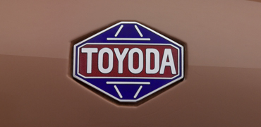
The name “Toyota” is derived from the family name of the company’s founder, Sakichi Toyoda. The company changed the brand name to the current Toyota in 1936 after holding a public competition to create a new logo.
What caused the change?
First, “Toyota” represents a voiceless consonant sound in Japanese, which is considered “clearer” than voiced consonants like in “Toyoda.” Another consideration is the quantity of strokes required to write Japanese characters, or jikaku. “Toyota” (トヨタ) has exactly eight strokes, which are thought to be associated with wealth and good fortune.
The transition also represented the growth of a small, independent business into a bigger corporation.
“Toyota” was chosen over “Toyoda” for the company brand name for three reasons:
1. The Japanese characters for “Toyota” were less complicated and cluttered in terms of commercial design. Additionally, the name had a more pleasing tone.
2. In the Japanese language, its eight stroke count was connected to prosperity and good fortune.
3. The company’s transformation from a family enterprise into a more widely recognized social entity was also suggested by the departure from the Toyoda brand name.
The Toyota Motor Company was established on August 28th, 1937, shortly after this design was registered as the trademark of Toyota automobiles in April of that same year.

The redesigned Toyota brand name and logo were unveiled on October 2, 1989.
The new logo, which represented Toyota’s progressiveness and reliability of Toyota was to be attached to all Toyota-brand cars as an emblem.
Its design consists of three ellipses. The letter T (for Toyota) is formed by the tightly interlocking inner horizontal and vertical ellipses, which stand for the expectations of customers and the ideal of the automaker, respectively. The outer ellipse represents Toyota’s superior technology’s worldwide reach and its limitless expansion potential.
One of the most important aspects of Toyota’s brand identity is the meaning behind its logo. Since red is a symbol of power and passion, Toyota uses hues like black, white, and red. Black is linked to refinement and strength, whereas white is a symbol of creativity and class.